
Crown Donut
brand identity & packaging
The challenge was to rebrand a local business. I chose a donut shop close to my home called Crown Donut. This was a popular early morning donut and breakfast drive through. It is in a convenient corner location for morning commuters to pick up a good breakfast on their way to work. This was one of my first projects in design school, and I was eager to revisit the design and update it.
target audience
My target audience was primarily commuting adults who are on their way to work. The goal was to appeal to people who want something sweet that is affordable and reliable, as well as younger people who are attracted to trendy designs and like to try new things.
In this redesign, I branched out from the logo and invested as much in the logotype and graphic assets incorporated in the brand. I also added the old school diner spin to enhance the fun experience and advertise a broader range of foods than.


sKETCHES
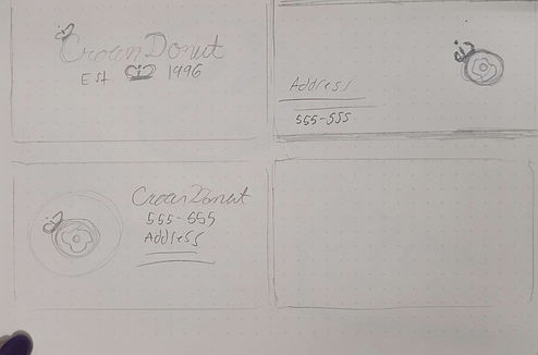
I tried out different diner styles in my sketches, ranging from french inspired to butcher house. I wanted something feminine and elegant, while keeping it simple.


rOUND ONE DRAFTS
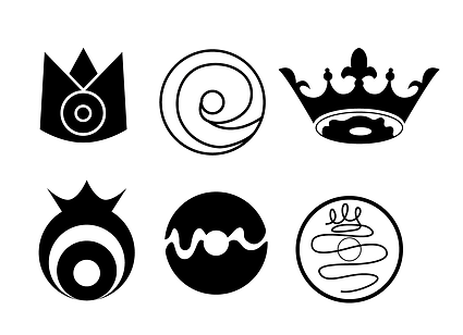
In my first drafts, I focused on the layout and the logotype. I gave the logotype an old school typeface and refined the lines and gave it some dimension. I knew this would be the focus of the branding design and wanted something strong and wildly applicable.



Final Design
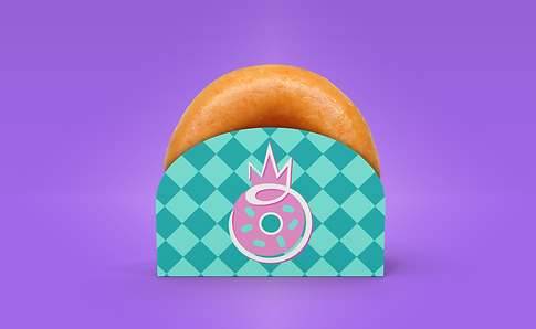
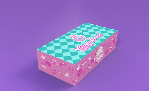
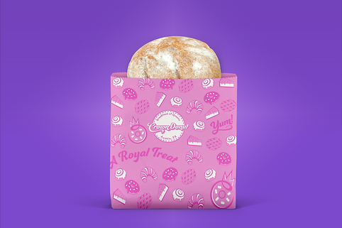
The single stroke donut wearing a crown rose above the rest of my logo designs because of its simplicity and uniqueness. Clients often use pictures of their food in advertising, so I include examples in my branding. I chose cute, colorful illustrations that matched the theme.
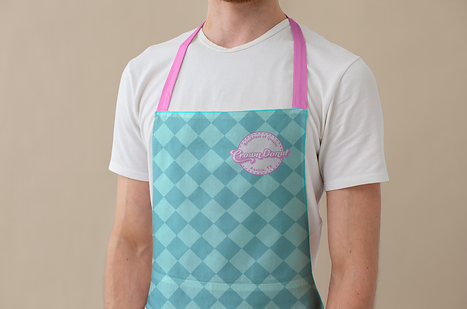
I combined these illustrations with a colorful pattern and branded slogans that can be used in further collateral.





REFLECTION
This project was a real joy to create. I love bright colors and I love creating appetizing designs. The branding is broadly applicable and unique, with lots of different assets to charm their customers. My design is trendy and eye catching, with a nod to timeless aesthetics.
If I wanted to expand on this design I would design more varieties of packaging for their products and design some branded merchandise like coffee mugs and drink tumblers.
Reflection
This project was a real joy to create. I love bright colors and creating appetizing designs. The branding is broadly applicable and unique, with varied assets to charm their customers. My design is trendy and eye catching, with a nod to timeless aesthetics.
If I wanted to expand on this design I would create more varieties of packaging for their products and design branded merchandise like coffee mugs and drink tumblers.
